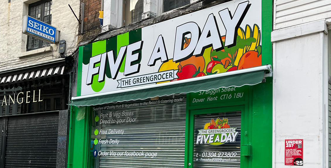
Signage Design Tips to Make Your Business Stand Out
A well-designed sign is one of the most effective ways to attract customers and make your business stand out. It serves as a visual representation of your brand and conveys essential information at a glance. In this post, we’ll explore key design tips to help you create signage that not only grabs attention but also leaves a lasting impression.
Focus on Readability
The primary purpose of signage is to communicate a message quickly and clearly. If your sign is difficult to read, potential customers might miss it entirely. Here are some essential tips for ensuring readability:
- Choose the Right Font: Select fonts that are simple, bold, and easy to read from a distance. Sans-serif fonts such as Arial, Helvetica, or Calibri are excellent choices for signage. Avoid overly decorative or script fonts, as they can be hard to decipher quickly.
- Font Size: Ensure your text is large enough to be readable from the intended viewing distance. As a rule of thumb, letters should be at least 2.5 cm tall for every 3 metres of viewing distance. For outdoor signs, larger text is crucial to capture attention from passing traffic.
- Use Clear Wording: Keep your message concise. The fewer words, the better! A simple and direct message, like “Summer Sale – 50% Off!” is more impactful than lengthy descriptions.
Embrace High Contrast Colours
Colour is a powerful tool in signage design. High-contrast colour combinations improve visibility and readability, making your sign more noticeable:
- Background and Text Contrast: Choose colours that contrast strongly. For example, black text on a white background or yellow text on a blue background. Avoid combinations that blend together, such as red text on a green background.
- Brand Colours: Incorporate your brand’s colour palette to maintain consistency and reinforce brand identity. If your brand colours are similar, introduce a contrasting background colour to make the text pop.
Incorporate Visual Hierarchy
Visual hierarchy guides the viewer’s eye through your sign and highlights the most important information. Here’s how to establish a clear hierarchy:
- Headline: Your headline should be the largest element, conveying the main message. It should catch the eye first and be immediately readable.
- Subtext: Use a smaller font size for additional information, such as contact details or a short tagline. Ensure this text supports the headline without overshadowing it.
- Logos and Graphics: Your logo should be prominent but not overpowering. Position it near the top or bottom corners to reinforce brand identity while keeping the focus on the main message.
Use Simple, High-Quality Graphics
Imagery can enhance your sign’s appeal, but too many graphics can make it cluttered and distracting. Here are some tips for incorporating graphics effectively:
- Choose One Strong Image: If your sign includes a graphic, select a single, high-quality image that directly relates to your message. For example, a bakery might use an image of a fresh loaf of bread to highlight its daily specials.
- Logo Placement: Your logo should be clear and easily recognisable. However, avoid making it the focal point unless the sign is purely for branding purposes.
- Keep It Simple: Simple, bold icons or illustrations can enhance your message without overwhelming the design.
Consider the Environment and Location
The environment where your sign will be displayed affects its design. Outdoor signs, for example, need to be weather-resistant and readable from a greater distance, while indoor signs may focus on providing more detailed information. Consider the following factors:
- Viewing Distance: The size and readability of your sign should be adapted to its location. Signs meant to be seen from the road should use large, bold text, while indoor signs can include more detail in smaller fonts.
- Lighting: Ensure your sign is visible in all lighting conditions. For exterior signage, consider illuminated options like LED lights to ensure it stands out at night or in poor weather.
- Placement: Position your sign at eye level where possible, and avoid obstructions like trees or other signage that could block its visibility.
Maintain Consistent Branding
Your signage should be an extension of your overall branding. Use consistent colours, fonts, and logos to create a cohesive look across all your signs. This consistency not only reinforces brand identity but also helps customers easily recognise your business.
Test Before Finalising
Before committing to a final design, test it in various conditions. Print a sample at scale and check its readability from different distances. Examine how the colours appear in natural light versus artificial light. Testing helps identify any issues that need adjustment, ensuring your sign has maximum impact.
Conclusion
A well-designed sign is a powerful marketing tool that can attract customers, communicate key messages, and strengthen your brand. By focusing on readability, using high-contrast colours, establishing a clear visual hierarchy, and maintaining consistent branding, you can create signage that makes your business stand out in a crowded marketplace.

